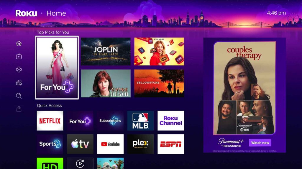
Roku’s new home screen is a big change, here’s how to use it
Hold up!
This article is for Advisorator’s paying members only. Subscribe now to unlock my full website and fast-track your tech knowledge.
Already a member? Sign into your account.


This article is for Advisorator’s paying members only. Subscribe now to unlock my full website and fast-track your tech knowledge.
Already a member? Sign into your account.